Eli Boettger | @boettger_eli | 02/17/2020

Why rank every Final Four logo since 1979? Well, why not?
With the Final Four now less than two months away, teams are jockeying for position in hopes of setting up a magical run that will conclude April 6 in Atlanta.
In the meantime, let’s rank each year’s Final Four logo since Magic Johnson and Larry Bird met for a national title in 1979.
42. 1982 — New Orleans

There is some old-school appeal with the ball and net, but … yikes.
41. 1988 — Kansas City

Probably not the best color scheme for a Final Four logo.
40. 2003 — New Orleans

I lOvE tHe FiNaL FoUr EvEn If ThE lOgO’s FoNt Is TeRrIbLe.
39. 1991 — Indianapolis

38. 1994 — Charlotte

37. 1986 — Dallas

Using a ‘D’ as the logo’s outline is a nice touch in an otherwise strange logo.
36. 1980 — Indianapolis

The font almost feels somewhat modern? Maybe?
35. 1997 — Indianapolis

Not a great logo track record thus far for Indy Final Fours.
34. 1998 — San Antonio

33. 2001 — Minneapolis

32. 1993 — New Orleans

Long live the verticality of old Final Four logos.
31. 2015 — Indianapolis

30. 2016 — Houston

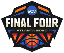
29. 2020 — Atlanta

Not exactly kicking off the new decade with much creativity.
28. 1989 — Seattle

27. 2006 — Indianapolis

“Hurry up, this is due in 15 minutes.”
26. 2014 — Arlington

25. 1979 — Salt Lake City

Would definitely consider picking up some 1979 Final Four merch at the local thrift store.
24. 2011 — Houston

23. 1983 — Albuquerque

22. 1990 — Denver

21. 2007 — Atlanta

20. 2010 — Indianapolis

19. 2018 — San Antonio

18. 2013 — Atlanta

17. 1981 — Philadelphia

The simplicity of this one works in its favor. Not bad for ’81.
16. 1992 — Minneapolis

Much better execution here than in 2001 (see No. 33).
15. 2004 — San Antonio

14. 2000 — Indianapolis

Does this logo look like it could be outside of a party supplies store? You bet it does!
13. 2017 — Phoenix

12. 1984 — Seattle

RIP Sonics.
11. 2002 — Atlanta

10. 2019 — Minneapolis

Trees on top and water on the bottom. This a pretty complete logo.
9. 1996 — East Rutherford

8. 2005 — St. Louis

7. 1995 — Seattle

6. 2012 — New Orleans

Font game here is strong. That shade of green might annoy some folks but it works here.
5. 2009 — Detroit

Plenty of Motor City feel with this one.
4. 2008 — San Antonio

Anyone capable of utilizing a cowboy hat in a Final Four logo in such an attractive way deserves a raise.
3. 1985 — Lexington

Kentucky Derby with a side of March Madness. Fun crossover.
2. 1987 — New Orleans

There is so much going on here and I love it.
1. 1999 — Tampa Bay

If this doesn’t make you want to go outside and shoot hoops on a sunny afternoon, nothing will. This logo is simply flawless.
You must be logged in to post a comment.